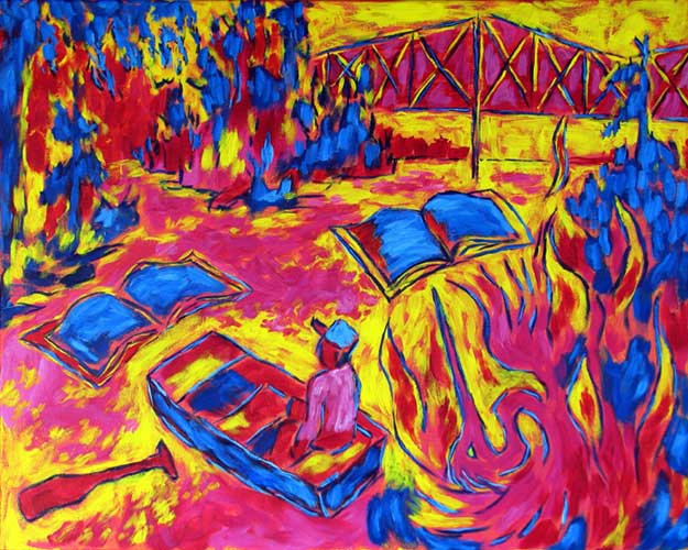

“Books on the River” contemporary figurative painting. acrylic on canvas. 30 in x 24 in.
“Books on the River” contemporary figurative painting
I’ve been experimenting heavily with saturated colors of a high intensity. I think there are several reasons for this, but there is one in particular that makes me laugh out loud at myself.
I am a self-taught painter, and when I started painting, all I had was student-grade paints, which frustrated me for years because I could never get the intense colors I saw in other artists’ work. Student-grade paints don’t have the pigment density of professional paints, and they often use substitute pigments that are translucent. This means that you can never get high color intensity from them unless they are painted in a thin layer directly over pure white. Like most painters, I rework the image many times as it resolves itself on the canvas, and that means that most areas of my paintings contain several layers of paint if not many layers. Professional-grade paint with a high density of opaque pigments ensures that the colors have full intensity no matter how many layers underneath.
Now that I have a handle on this issue, I think I will start painting in grays and other low-intensity mixtures and using intense colors as accents in select areas. I think this will compliment the dream-like effect I am trying to create, and it should work well with the “drawn” or outlined technique that I use to render compositions that come from my mind without the use of models.